CSS: Cascading Style Sheets - A Definitive Guide on How to use height, width and max-width
{tocify} $title={Table of Contents}
CSS, or Cascading Style Sheets, is a powerful tool that allows web developers to control the presentation of their web pages. With CSS, you can define the look and feel of your website, including its layout, typography, colors, and more.
In this definitive guide, we will explore three important CSS properties - height, width, and max-width - and show you how to use them effectively to control the size and layout of your web pages.
let's define each of these properties with examples of how to use them in CSS:
- Height Property:
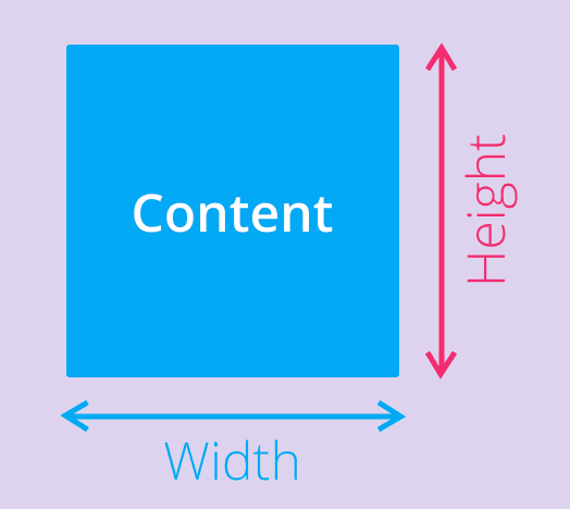
The CSS height property sets the height of an HTML element. It defines the vertical height of an element's content area, such as a div container, text box, or image.
The height can be specified in various units, including pixels, percentages, ems, and more.
The height property is commonly used to create fixed-height containers for content, such as images or videos, or to set the height of columns in a grid layout.
Here's an example of how to set the height of a container element to 500 pixels:
.container {height: 500px;}{codeBox}
- Width Property:
The CSS width property sets the width of an HTML element. It defines the horizontal width of an element's content area, such as a div container, text box, or image.
Like the height property, the width can be specified in various units, including pixels, percentages, ems, and more.
The width property is commonly used to create fixed-width containers for content, such as images or videos, or to set the width of columns in a grid layout.
Here's an example of how to set the width of a container element to 80%:
.container {width: 80%;}{codeBox}
- Max-width Property:
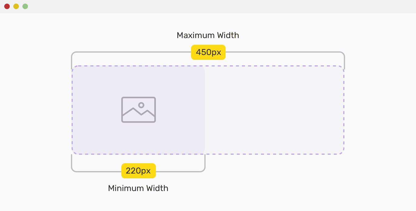
The CSS max-width property sets the maximum width of an HTML element. It defines the maximum horizontal width that an element can have, regardless of its content.
This property is particularly useful for creating responsive web designs that adapt to different screen sizes and devices.
By setting a max-width value, the element will scale down to fit within the available space, without exceeding the specified width.
The max-width property can be specified in various units, including pixels, percentages, ems, and more.
Here's an example of how to set the maximum width of a container element to 450 pixels:
.container {max-width: 450px;}{codeBox}
For what CSS height, width, and max-width properties are used:
CSS height, width, and max-width properties are used to control the size and layout of elements on a web page. Here are some reasons why they are commonly used:
- Consistent Layout:
By setting the height and width of elements, developers can ensure that their designs have a consistent layout across different devices and screen sizes.
This can help to improve the user experience and make the content more readable and accessible.
- Responsive Design:
The max-width property is particularly useful for creating responsive designs that adapt to different screen sizes.
By setting a maximum width, developers can ensure that elements don't become too large and overwhelm the user's screen, while still allowing the content to scale down as needed on smaller devices.
- Image Optimization:
By using the height and width properties on images, developers can control the size and aspect ratio of the images on their web pages.
This can help to optimize the images for faster loading times and better performance.
- Text Layout:
The height and width properties can be used to create text blocks that are more visually appealing and easier to read.
By controlling the size of the text block, developers can ensure that the text is properly aligned and spaced, improving the readability of the content.
CSS height and width Values
The height and width properties may have the following values:
- auto - This is default. The browser calculates the height and width
- length - Defines the height/width in px, cm, etc.
- % - Defines the height/width in percent of the containing block
- initial - Sets the height/width to its default value
- inherit - The height/width will be inherited from its parent value
CSS height and width Examples
Here are some examples of how to use the height and width properties in CSS:
- Setting a fixed height and width:
div {height: 200px;width: 400px;}{codeBox}
This code sets the height of the “div” element to 200 pixels and the width to 400 pixels. This creates a fixed-size container that will always have the same dimensions, regardless of its content.
- Setting a percentage-based height and width:
div {height: 50%;width: 75%;}{codeBox}
This code sets the height of the “div” element to 50% of its parent element's height, and the width to 75% of its parent element's width. This creates a container that is relative to its parent element, and will adjust its size based on the size of the parent.
- Setting a height and width in viewport units:
div {height: 50vh;width: 80vw;}{codeBox}
This code sets the height of the div element to 50% of the viewport height, and the width to 80% of the viewport width. This creates a container that is relative to the size of the user's viewport, and will adjust its size based on the size of the browser window.
- Setting the height and width of an image:
img {height: 200px;width: 300px;}{codeBox}
This code sets the height of the “img” element to 200 pixels and the width to 300 pixels. This creates a fixed-size image that will always have the same dimensions, regardless of its original size.
- Setting the height and width of a text box:
input[type="text"] {height: 30px;width: 200px;}{codeBox}
This code sets the height of the input element with a type of "text" to 30 pixels and the width to 200 pixels. This creates a fixed-size text box that will always have the same dimensions, regardless of the length of the text entered.
These are just a few examples of how to use the height and width properties in CSS.
By adjusting these values, developers can create containers and elements of various sizes and dimensions to suit their design and layout requirements.
Examples: using max-width properties
Here are some examples of how to use the max-width properties in CSS:
- Setting a maximum width on an image:
img {max-width: 100%;}{codeBox}
This code sets the maximum width of the “img” element to 100% of its parent element's width. This ensures that the image will never be wider than its container, but will still scale down proportionally as the container size decreases.
- Setting a maximum width on a responsive layout:
.container {max-width: 1200px;margin: 0 auto;}{codeBox}
This code sets the maximum width of the “.container” element to 1200 pixels. This creates a responsive layout that will scale down as the browser window size decreases, but will never be wider than 1200 pixels.
The “margin: 0 auto;” code centers the container on the page.
- Setting a maximum width on a text block:
p {max-width: 500px;}{codeBox}
This code sets the maximum width of the “p element” to 500 pixels. This creates a text block that will never be wider than 500 pixels, even if the browser window size or the container size is larger.
This is particularly useful for ensuring readability and legibility of longer blocks of text.
- Setting a maximum width on a navigation menu:
nav {max-width: 800px;}{codeBox}
This code sets the maximum width of the “nav” element to 800 pixels. This creates a navigation menu that will never be wider than 800 pixels, even if the content within it changes.
This can help to ensure that the navigation menu remains consistent across different pages and screen sizes.
Examples: how to use the height, width, and max-width properties together on the same element:
Here's an example of how to use the height, width, and max-width properties together on the same element:
.container {height: 500px;width: 80%;max-width: 1200px;margin: 0 auto;}{codeBox}
In this example, we're creating a container element with a fixed height of 500 pixels, a width of 80% of its parent element's width, and a maximum width of 1200 pixels. The “margin: 0 auto;” code centers the container on the page.
What this means is that the container will always be 500 pixels tall, but its width will vary depending on the size of its parent element.
If the parent element is wider than 1200 pixels, the container will not grow beyond a width of 1200 pixels.
However, if the parent element is narrower than 1200 pixels, the container will adjust its width to fit within the parent element, up to a maximum of 80% of the parent element's width.
By using these three properties together, developers can create containers that are both fixed in height and variable in width, while also ensuring that the width doesn't exceed a certain limit. This can be useful for creating responsive designs that adjust to different screen sizes and orientations.
Conclusion:
In conclusion, the “height, width, and max-width” CSS properties are powerful tools that allow web developers to control the size and layout of their web page elements.
The “height” property controls the height of an element, while the “width” property controls the width. These properties can take several types of values, including pixels, percentages, viewport units, ems, and auto.
The “max-width” property allows developers to set a maximum width for an element, preventing it from expanding beyond a certain point. It also offers the same value options as the “width” property, along with the option to set “none” for no maximum width.
Using these properties can help make a web page more responsive and adaptable to different screen sizes and devices, as well as improving the overall visual design and layout.
Small Note:
Friends, according to my expertise, I have written complete information to help you with “CSS dimension: height, width and max-width” If this post is favourable for you or not, please tell me by commenting.
If you liked this post, do not forget to share it with your friends so they can get information about it.
You can ask us through comments if you still have questions or doubts, I will answer all your questions, and you can contact us for more information.
Please tell us through the comment section if you think we miss anything.


